Click on the image to see a PDF version (for zooming in)
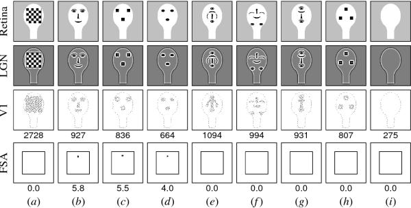
Fig. 10.6. Response to schematic images by Goren et al. (1975) and
Johnson et al. (1991). The activations of the retina, LGN, V1, and
FSA levels are shown using the plotting conventions from Figures 10.4
and 10.5. The top row shows a set of input images as they are drawn on
the retina. These patterns were presented to newborn human infants on
head-shaped paddles moving at a short distance (about 20 cm) from the
eyes, against a light-colored ceiling. The newborn's preference was
determined by measuring the average distance his or her eyes or head
tracked each pattern, compared with other patterns. Below, x > y
indicates that image x was preferred over image y under those
conditions. Goren et al. (1975) measured infants between 3 and 27
minutes after birth. They found that b > f > i and b > e >
i. Similarly, Johnson et al. (1991), in one experiment measuring
within 1 hour after birth, found b > e > i. In another, measuring
at an average of 43 minutes, they found b > e, and b > h. Finally,
Johnson and Morton (1991), measuring newborns an average of 21 hours
old, found that a > (b,c,d), c > d, and b > d. The HLISSOM model
has the same preference for each of these patterns, as shown in the
images above. The second row shows the model LGN activations resulting
from the patterns in the top row. The third row shows the V1
activations, with the numerical sum of the activities shown
underneath. If only one unit were active at half strength, the sum
would be 0.5; higher values indicate more activation. The bottom row
displays the settled responses of the FSA, again with the numerical
sum underneath. This sum represents the strength of the response of
the model. The images are sorted left to right according to the
preferences of the model. The strongest V1 response by nearly a factor
of three is to the checkerboard pattern (a), which explains why the
newborn would prefer that pattern over the others. The facelike
patterns (b-d) are preferred over patterns (e-i) because of activation
in the FSA. The details of the facelike patterns do not significantly
affect the results -- all of the facelike patterns (b-d) lead to FSA
activation, generally in proportion to their V1 activation levels. The
remaining patterns are ranked by their V1 activity alone, because they
do not activate the FSA. In all conditions tested, the HLISSOM model
shows behavior remarkably similar to that of the newborns, and
provides a detailed computational explanation for why these behaviors
occur. Reprinted from Bednar and Miikkulainen (2003a).
|